Preloading responsive images
Responsive images overview
Suppose you're browsing the web on a screen that's 300 pixels wide, and the page just requested an image that's 1500 pixels wide. That page just wasted a lot of your cellular data because your screen can't do anything with all of that extra resolution. Ideally, the browser should fetch a version of the image that's just a little wider than your screen size, say 325 pixels. This ensures a high-resolution image without wasting data. And, even better, the image will load faster. Responsive images enable browsers to fetch different image resources to different devices. If you don't use an image CDN you need to save multiple dimensions for each image and specify them in the srcset attribute. The w value tells the browser the width of each version. Depending on the device, the browser can choose the appropriate one:
<img src="small.jpg" srcset="small.jpg 500w, medium.jpg 1000w, large.jpg 1500w" alt="…">
Preload overview
Preload lets you tell the browser about critical resources that you want to load as soon as possible, before they are discovered in HTML. This is especially useful for resources that are not easily discoverable, such as fonts included in stylesheets, background images, or resources loaded from a script.
<link rel="preload" as="image" href="important.png">
Responsive images + preload = faster image loads
Responsive images and preload have been available for the last few years, but at the same time something was missing: there was no way to preload responsive images. Starting in Chrome 73, the browser can preload the right variant of responsive images specified in srcset before it discovers the img tag!
Depending on your site's structure, that could mean significantly faster image display! We ran tests on a site that uses JavaScript to lazy-load responsive images. Preloading resulted in images loading 1.2 seconds faster.
imagesrcset and imagesizes
To preload responsive images, new attributes were recently added to the <link> element: imagesrcset and imagesizes. They are used with <link rel="preload"> and match the srcset and sizes syntax used in <img> element.
For example, if you want to preload a responsive image specified with:
<img src="wolf.jpg" srcset="wolf_400px.jpg 400w, wolf_800px.jpg 800w, wolf_1600px.jpg 1600w" sizes="50vw" alt="A rad wolf">
You can do that by adding the following to your HTML's <head>:
<link rel="preload" as="image" href="wolf.jpg" imagesrcset="wolf_400px.jpg 400w, wolf_800px.jpg 800w, wolf_1600px.jpg 1600w" imagesizes="50vw">
This kicks off a request using the same resource selection logic that srcset and sizes will apply.
Use cases
Preloading dynamically-injected responsive images
Let's say you're dynamically-loading hero images as part of a slideshow and know which image will be displayed first. In that case, you probably want to avoid waiting for the script before loading the image in question, as that would delay when users can see it.
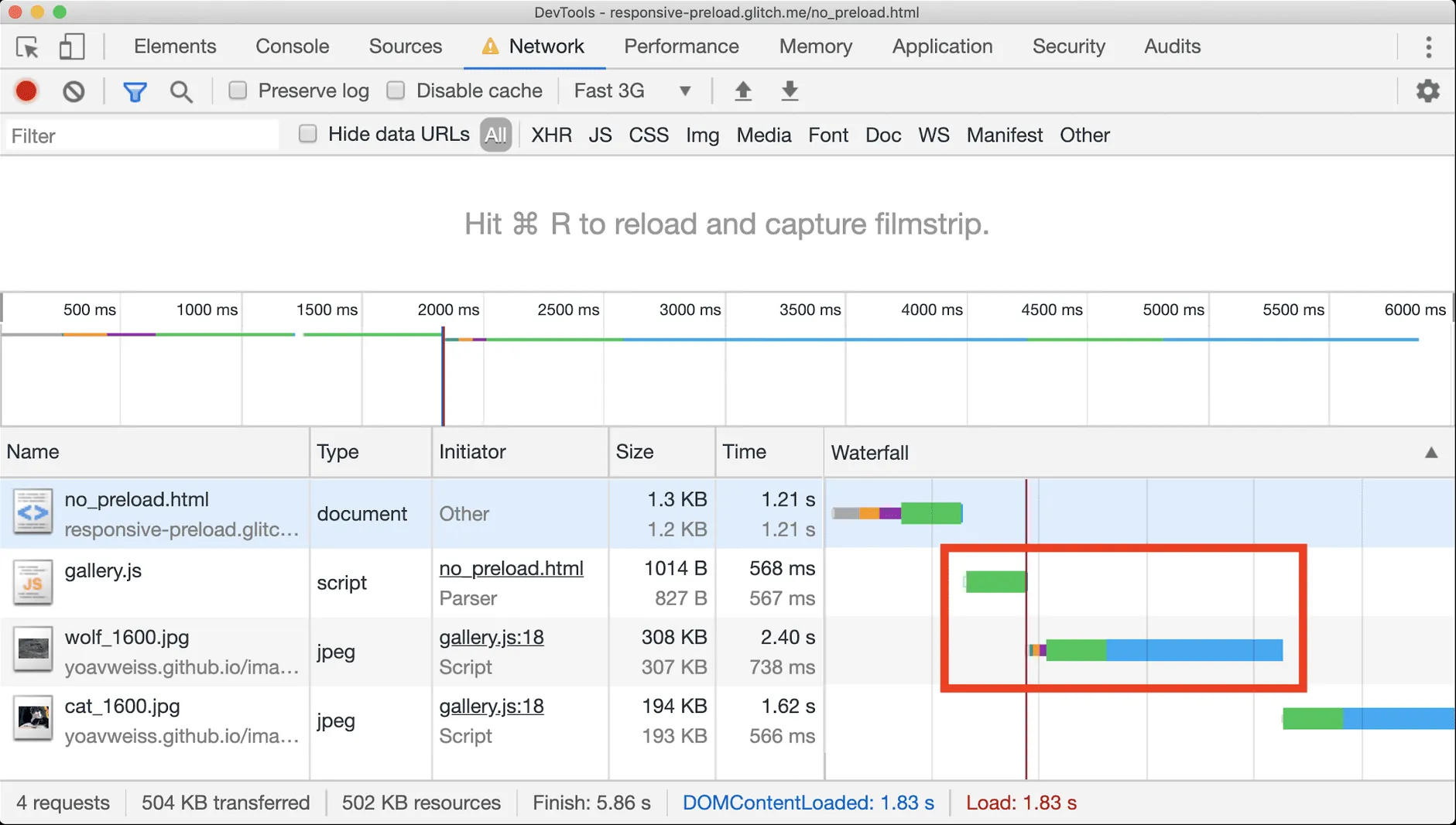
You can inspect this issue on a website with a dynamically-loaded image gallery:
- Open this example website in a new tab.
- Press Control+Shift+J (or Command+Option+J on Mac) to open DevTools.
- Click the Network tab.
- In the Throttling drop-down list, select Fast 3G.
- Disable the Disable cache checkbox.
- Reload the page.
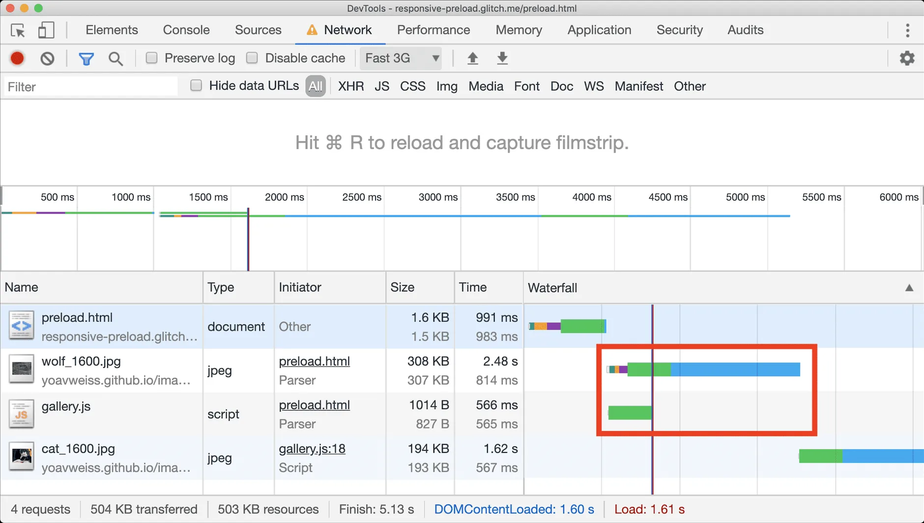
Using preload helps here because the image starts loading ahead of time and is likely to already be there when the browser needs to display it.
To see the difference that preloading makes, you can inspect the same dynamically-loaded image gallery but with preloaded first image by following the steps from the first example.
Preloading background images using image-set
If you have different background images for different screen densities, you can specify them in your CSS with the image-set syntax. The browser can then choose which one to display based on the screen's DPR .
background-image: image-set( "cat.png" 1x, "cat-2x.png" 2x);
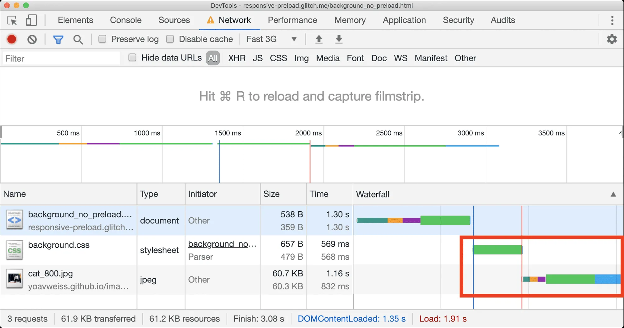
The problem with CSS background images is that they are discovered by the browser only after it has downloaded and processed all the CSS in the page's <head>, which can be a lot of CSS…
You can inspect this issue on an example website with responsive background image .
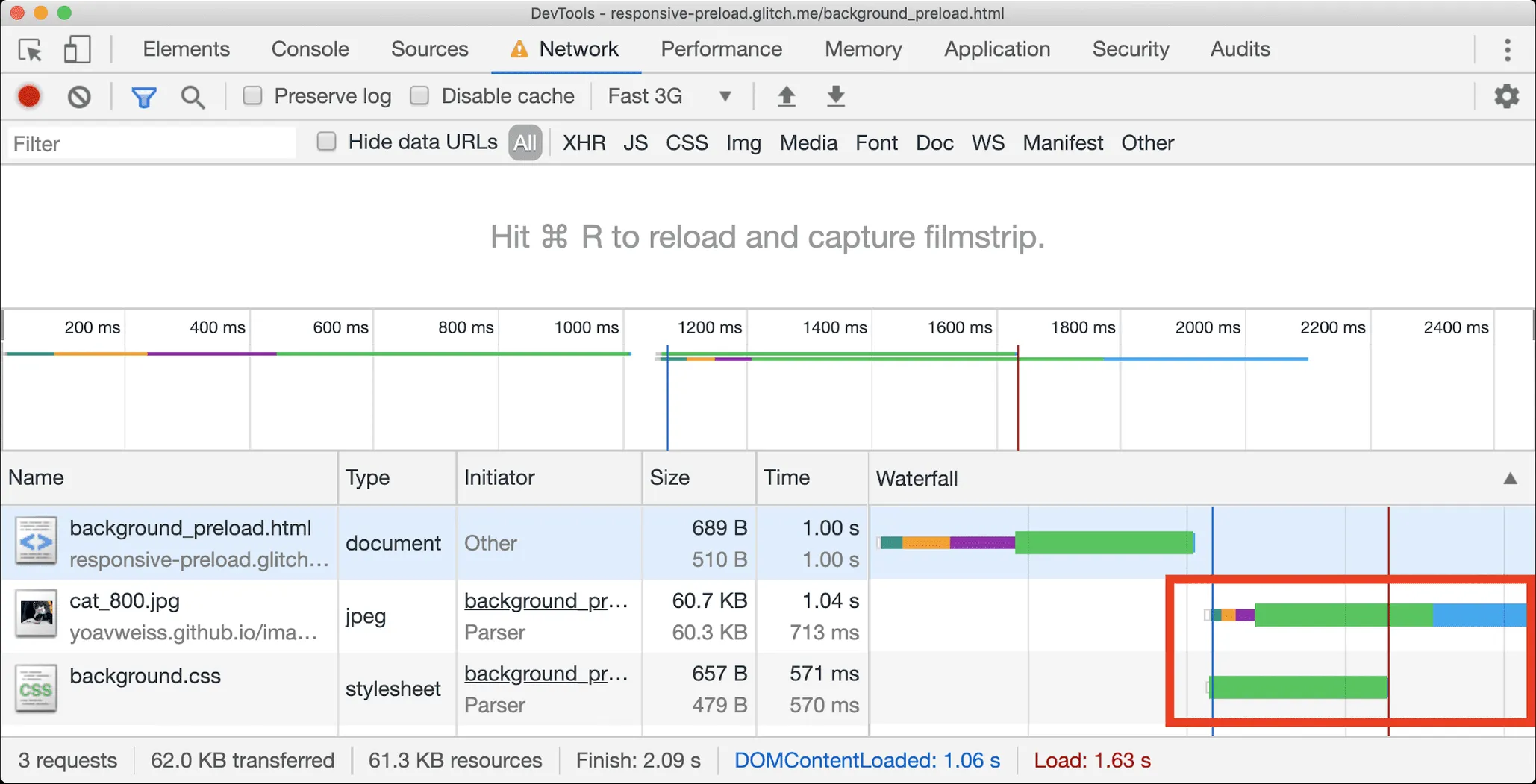
Responsive image preloading provides a simple and hack-free way to load those images faster.
<link rel="preload" as="image" imagesrcset="cat.png 1x, cat-2x.png 2x">
Note that by excluding the href attribute, you can ensure the browsers that do not support imagesrcset on the <link> element, but do support image-set in CSS, will not download an incorrect source. However, they will also not benefit from the preload in this case.
You can inspect how the previous example behaves with preloaded responsive background image .
Preloading responsive images in action
Preloading your responsive images can speed them up in theory, but what does it do in practice?
To answer that I created two copies of a demo PWA shop : one that does not preload images , and one that preloads some of them . Since the site lazy loads images using JavaScript, it's likely to benefit from preloading the ones that will be in the initial viewport.
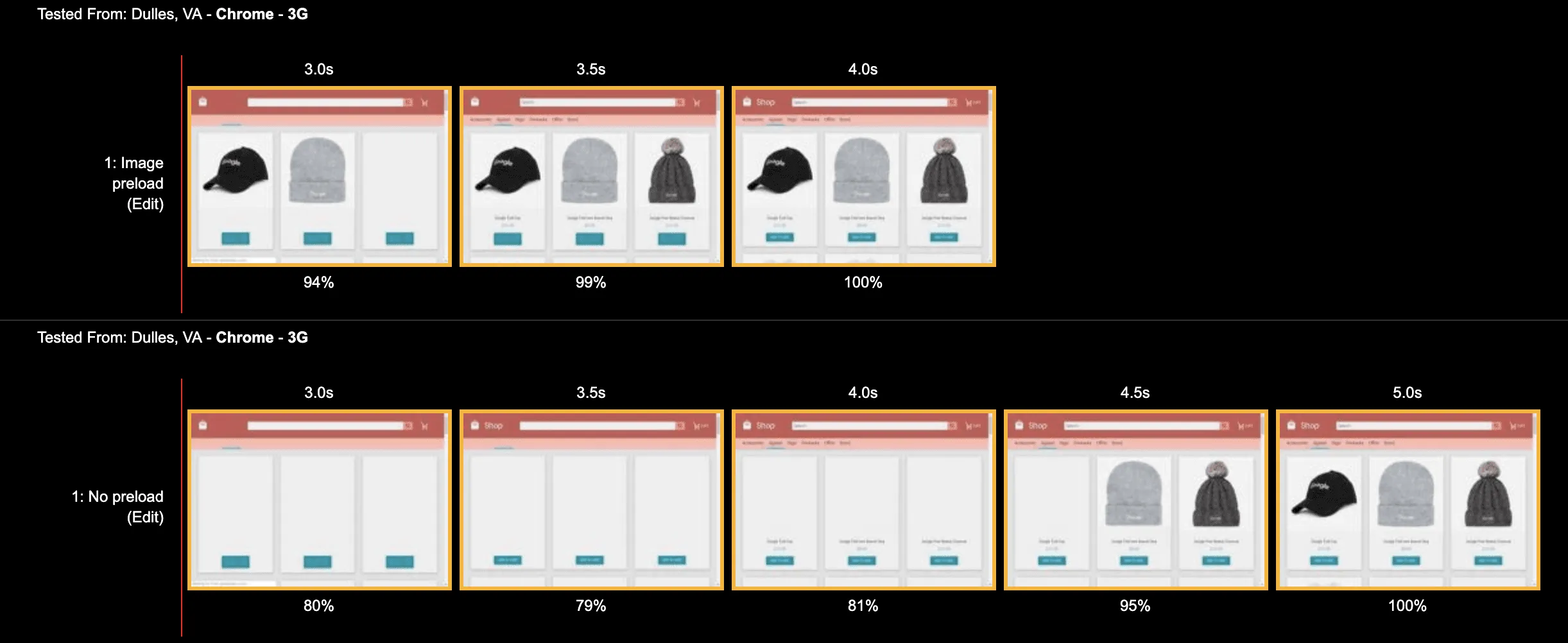
That gave me the following results for no preload and for image preload . Looking at the raw numbers we see that Start Render stayed the same, Speed Index slightly improved (273 ms, as images arrive faster, but don't take up a huge chunk of the pixel area), but the real metric which captures the difference is the Last Painted Hero metric, which improved by 1.2 seconds. 🎉🎉
Of course, nothing captures the visual difference quite like a filmstrip comparison:
Preload and <picture>
If you're familiar with responsive images, you may be wondering "What about <picture> element?".
The Web Performance Working Group is talking about adding a preload equivalent for srcset and sizes, but not the <picture> element, which tackles the "art direction " use-case.
Why is this use-case being "neglected"?
While there's interest in solving that use case as well, there are still a number of technical issues to sort out which means that a solution here would have significant complexity. On top of that, it seems like for the most part, the use-case can be addressed today, even if in a hacky way (see below).
Given that, the Web Performance WG decided to ship srcset first and see if the demand for equivalent picture support arises.
If you do find yourself in a position to preload <picture> you may be able to use the following technique as a workaround.
Given the following scenario:
<picture>
    <source srcset="small_cat.jpg" media="(max-width: 400px)">
    <source srcset="medium_cat.jpg" media="(max-width: 800px)">
    <img src="large_cat.jpg">
</picture>
The <picture> element's logic (or the image source selection logic, to be precise), would be to go over the media attributes of the <source> elements in order, find the first one that matches, and use the attached resource.
Because responsive preload has no notion of "order" or "first match", the breakpoints need to be translated into something like:
<link rel="preload" href="small_cat.jpg" as="image" media="(max-width: 400px)">
<link rel="preload" href="medium_cat.jpg" as="image" media="(min-width: 400.1px) and (max-width: 800px)">
<link rel="preload" href="large_cat.jpg" as="image" media="(min-width: 800.1px)">
Preload and type
The <picture> element also supports matching on the first type, to allow different image formats to be provided and the browser to pick the first image format it supports. This use case is not currently supported with preload.
For sites using this, avoiding preload is the best option, and instead having the preload scanner pick these up from the <picture> and <source> elements instead. This is a best practice anyway, particular with the support of Priority Hints which allows the appropriate image to be prioritised in a better manner than preload alone.
Effects on Largest Contentful Paint (LCP)
Since images can be candidates for Largest Contentful Paint (LCP) , preloading them may improve your website's LCP. Using the techniques above, you can also ensure that your responsive images will load more quickly.
Regardless of whether the image you're preloading is responsive, be aware that preloads work especially well when the image resource isn't discoverable in the initial markup payload. For websites that send complete markup from the server, you may not realize a huge benefit. However, if your website renders markup on the client—which sidesteps the browser's preload scanner — there's an opportunity on the table to preload potential LCP images to improve performance.
Summary
Responsive image preload gives us new and exciting possibilities to preload responsive images in ways that were previously only possible using hacks. It's an important new addition to the speed-conscious developer's toolbox and enables us to make sure the important images we want to get in front of our users as soon as possible will be there when we need them.
Of course, nothing captures the visual difference quite like a filmstrip comparison:
